Japanese cuisine
-
AKA
Bringing new zen into the restaurant environment. A high-end Japanese restaurant provides a Japanese twist with spirit and local culture. Aka features a number of private rooms for events and an amazing dining experience.

-
Bringing new zen into the restaurant environment. A high-end Japanese restaurant provides a Japanese twist with spirit and local culture. Aka features a number of private rooms for events and an amazing dining experience.

—
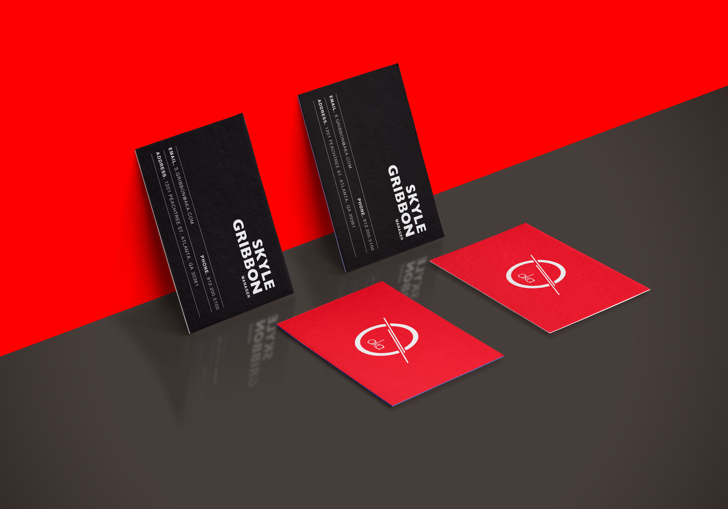
The name Aka implies a perspective of harmony and the color of red. We embraced the idea of these perspectives and established a form of Asian dining wear, such as a bowl and chopsticks, into the logo. The diagonal linework extends beyond the logo boundary to become a prominent element of the design layout.
The color is designed to represent the perspective of the name “Aka” and to feel exquisite taste. The typography is a lowercase san serif with a modern Japanese character shape to balance between traditional and contemporary.


